Let’s play a game. Imagine a book cover emblazoned with an illustrated figure, or two. Their faces are obscured, either by sunglasses or a brushstroke. Or maybe there’s nothing at all – a patch of negative space where eyes and lips should be. The figures are outlined, flat, drawn in blocky silhouettes. The title? Always a tasteful sans serif on a colourful backdrop.
What book are you thinking of? Crazy Rich Asians? Where’d You Go, Bernadette? Or something more recent – Intimacies, Lucy Caldwell’s short-story collection about the misadventures of various young women. Or Show Them a Good Time, Nicole Flattery’s short-story collection about the misadventures of various young women.
Perhaps it’s Australian: Jessie Tu’s A Lonely Girl Is a Dangerous Thing. Perhaps it’s translated: Nanae Aoyama’s A Perfect Day to Be Alone. Perhaps it’s brand-new, like the latest from Pulitzer finalist Adam Haslett, Mothers and Sons. Actually, no. It’s obviously Sally Rooney’s Conversations with Friends.
Peruse enough bookstores – or just stroll past their window displays – and you’ll certainly have encountered the design trends adorning our best (and bestselling) literature. Illustrations abound: always saturated, never subtle. The hues burn. The text shouts. It’s an optometrist’s pay day.
Book covers have always sold – or oversold – their contents. Like all art, book design is a sign of the times: of consumer whims and cultural advances. The best ones are works of art in their own right; even the most prosaic signal something about genre and tone. But right now, covers are louder, bigger, weirder, musclier; the nerd who got jacked and made it everyone’s business.
So, how did we get here?
To understand the trend cycle of a book cover is to prise open the publishing industry: all its mysteries and myths, its arcane machinations and archaic rituals. Long before an artist has touched a draft, decisions have already been inked.
Evi O, an award-winning book designer and publisher who spent a decade at publishing house Penguin before opening her eponymous design studio, says the process frequently starts with a literary agent. “Since the beginning,” she says, “the agent has already shaped some kind of positioning, some kind of financial promise.”
From an author’s work, an agent extracts potential value. It’s Rooney meets Moshfegh. It’s Richard Osman set in Castlemaine. It’s Helen Garner for TikTok users. (I pray this last one does not exist.)
Award-winning book designer Evi-O. Credit: Andrew Grune
These comparisons – sold by agents and shaped by editors and publishers – often feed directly into a cover. For designers, publishers produce a brief including “a synopsis, positioning, competition, top 10 in the [market]”, Evi O says. A book is weighed against its confreres in the same genre and a designer begins conceptualising anywhere up to 15 different directions.
This is how a bestselling cover ends up with hordes of copycats. Look no further than Atomic Habits – the 2018 mega-phenomenon that still keeps airport bookshops afloat – and then look at its pop psychology peers, like recent brain bender The Dose Effect or recent heavy hitter The Let Them Theory. All three feature text in chunky, declarative letters, haloed by a field of dots. “This is science!” the dots aver. They’re meant to resemble pixels, light particles, the minutiae of the universe. But if you squint they look like mosquitoes on a summer porch.

The exploding atoms are hard to miss on bookshelves these days.
At each stage, says Evi O, contact between authors and designers is limited – sometimes even discouraged. The most thorough designer will read an entire manuscript to ensure their work is faithful to the source, although just as often they’ll pull ideas straight from the brief. They’ll send their drafts back to the publisher, who then prods and probes each design in a cover meeting with other internal bigwigs.
“The interesting thing is what happens in that cover meeting room,” Evi O says. “And the most annoying people in that meeting are sales and marketing.” This is the department, she says, where data reigns supreme and covers get homogenised. Their response is always consistent: “The type is not big enough! … It doesn’t matter how quiet a story is, they believe if you can read [the title], you’re already winning.”
Design titan Jon Gray was behind the design for Sally Rooney’s Normal People.
And so the operation repeats. The designer tweaks, the publishing house doles out feedback – until the cover, like all covers, is sufficiently showy, pleading for the attention of a wayward buyer.
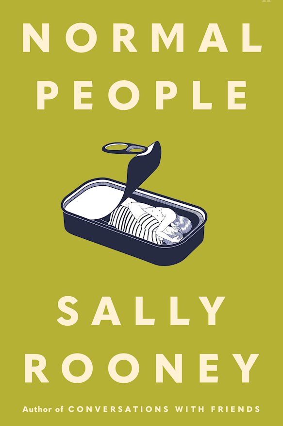
Of course, the most resilient designers find glimmers of idiosyncrasy even in the anonymising churn. Just look at Evi O’s studio, whose covers are thrillingly acidic, brimming with winding illustrations that invite a second – and third – glance. She also name-checks Australian artist Josh Durham, who wields a “clever” visual humour, as well as Jon Gray, the design titan behind all of Zadie Smith’s recent books – and the famous sardine tin of Normal People.
No good cover, though, goes unpunished. Even the best idea gets boring when it’s emulated a hundred times – as it is in the publishing industry.
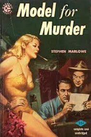
Painted pulp covers dominated in the 1940s and ’50s.
“They like to play it safe,” Evi O says, “and that’s why you end up with all these covers looking quite similar.”
But book covers have always followed trends. In the history of book covers, you can divine the development of both technology and social preferences writ large.
Like our contemporary eye-poppers, the earliest book jackets were gaudy affairs. Pages were hand-bound and wrapped in leather and goatskin; luxury volumes in medieval times were further embellished with treasure binding, a form of book cover encrusted with gems and precious metals. The flashier the book, the closer to God. The association has never quite waned.
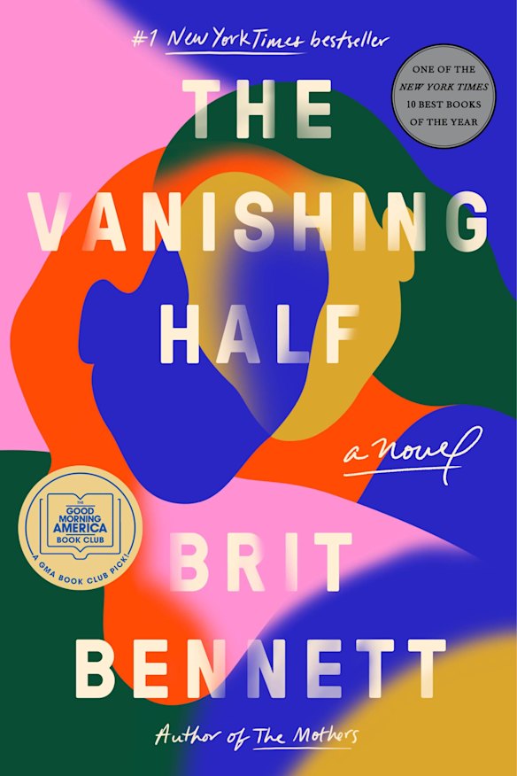
The Vanishing Half was one of many books that embraced the abstract cover.
In the 19th century, advances in book-binding birthed the first printed, mass-produced covers, designed to tout and titillate on a much broader scale than the bespoke finishes of yore. As the publishing industry matured and ballooned in the 20th century, the trends flew thick and fast: the painted pulp covers of the 1940s and ’50s, the ascension of photography in the 1960s, the outre typographic experimentations of the ’70s.
Even the best idea gets boring when it’s emulated a hundred times – as it is in the publishing industry.
Dr Jenny Grigg, a senior design lecturer at Melbourne’s RMIT University, says book covers have long been subject to market whims. “There’s all of these undercurrents of how books are sold, how publishers choose to sell their books as fashion accessories or to tap the right market,” she says. “The actual reading experience is so distant … and sales-based.”
Often, one literary mega-hit can spawn hundreds of imitators. I still shudder at the sight of an abstract blob: those cotton-candy nebulae that bedecked the covers of two bestsellers – Brit Bennett’s The Vanishing Half and Torrey Peters’ Detransition, Baby – before saturating every single book cover from 2020 to 2022 in a rainbow of terror.
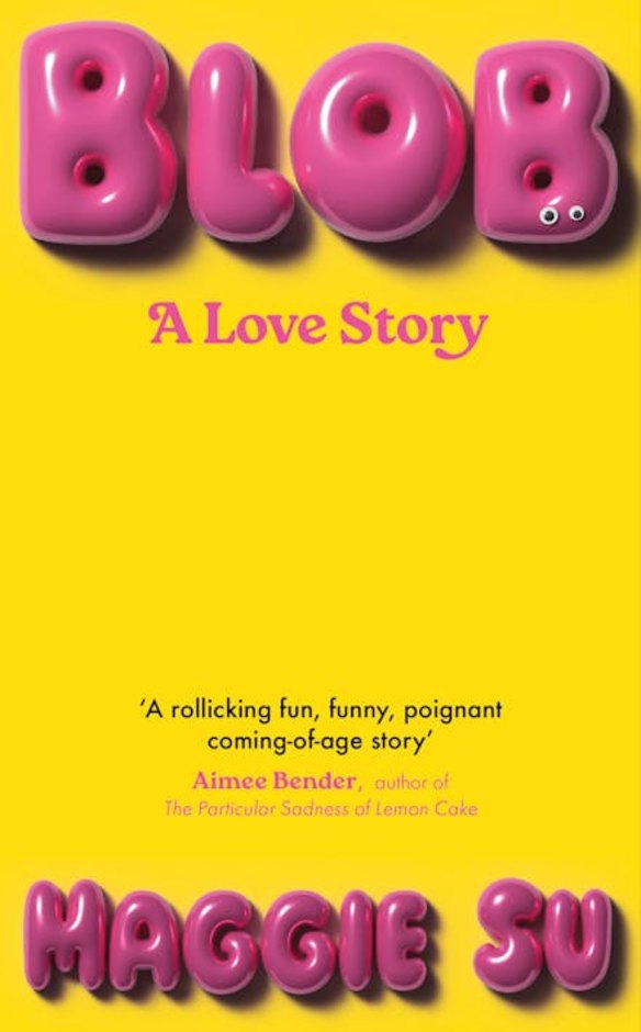
Blob has been a stand-out design.
Others might have a similarly Pavlovian response to the melancholy women adorning fiction of late – always turned away, often in a red dress, sometimes born from a single stock image and doomed to eternal duplication.
Grigg used to work in commercial publishing, where she found herself brushing up against this copycat mentality. “The example I always come back to,” she says, “is a 20-strong sales team just wanting the amount of sales that Dan Brown had with The Da Vinci Code. They thought it was totally reasonable to say, ‘Can you just design a version of this book?’”
What, then, do our modern proclivities say about us? We’re awful and we’re common – that hasn’t changed.
It’s a battle that’s been raging for decades. In 1974, a cadre of top US designers formed an organisation called Graphic Artists for Self-Preservation – that’s GASP for short – protesting the homogeneity of their hallowed profession. “I’m working on four novels of possession right now,” one illustrator told The New York Times. “And they all want the same thing. A combination of Rosemary’s Baby and The Exorcist.” Gulp. Gasp!
Sometimes, even authors have taken up the pitchfork: when Agatha Christie released her Poirot novel Sad Cypress in 1940, she lambasted her publisher for their aesthetic sensibilities. “Don’t let Collins decide univocally on some frightful cover,” she wrote in letters released in 2015. “Their jackets … are AWFUL – so COMMON!!”
The text-heavy cover is also popular.
What, then, do our modern proclivities say about us? We’re awful and we’re common – that hasn’t changed. But according to a new Australia Reads survey conducted by Monash University, most of us are now reading for comfort more than for any other emotion. And “there’s comfort in trends”, says Grigg.
On the internet, the dizzying pigments and mammoth titles of contemporary volumes are more conspicuous, more diversionary than their quieter peers. In the US, Amazon controls more than 50 per cent of the print book market – and a cover, says Evi O, “needs to work on an Amazon thumbnail”.
It also needs to work amid the constant hum of a TikTok or Instagram feed, where online bibliophiles can make or break an author’s career within 45 seconds. “You want a cover that is … recognisable on the screen, even when it’s flipped, [because] a lot of people film with the front camera,” says Jing Xuan Teo, co-founder of the online bookstore Amplify. “You want something [where] the title is so large that you can see it at a distance from the camera … on the bookshelf or on the bedside table.”
One of Teo’s favourites this year is Maggie Su’s Blob, a romance between a woman and a gelatinous splodge whose cover is simple: a hunk of squelching text on a sea of yellow. Its title treatment is uniquely (and aptly) disgusting, like a distended zit that might burst at any second.
Romance novels have embraced the illustration.
But its layout is hardly original. You’ll see the same trope – huge text with few other graphic markers on the page – in dozens of new covers. There’s the shuddering title of Katie Kitamura’s equally destabilising Audition; the devilish font of Rejection, Tony Tulathimutte’s carnival of grotesqueries; the hulking serif of Ada Calhoun’s barbed marriage novel Crush.
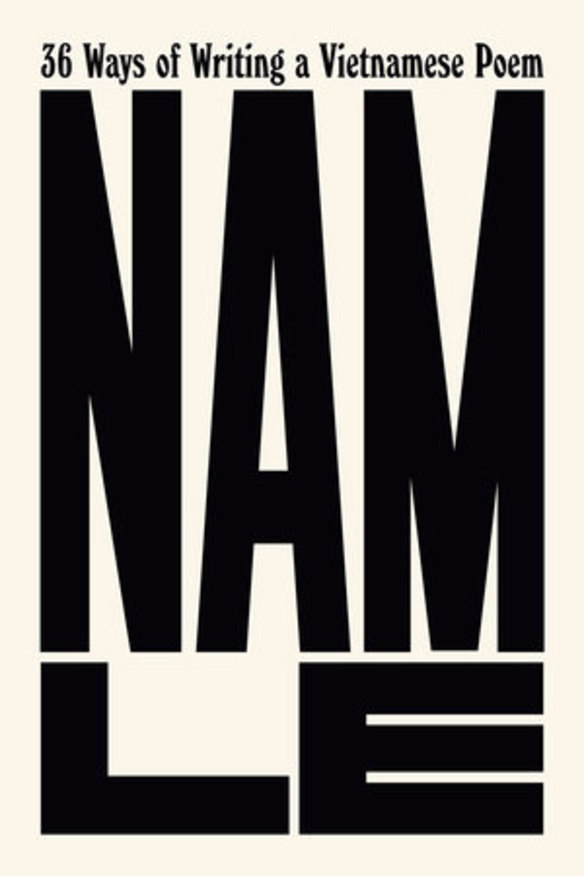
Not even Vietnamese-born Australian writer Nam Le is immune: the US cover of his 2024 collection 36 Ways of Writing a Vietnamese Poem rendered his name in domineering fashion, extended over the page like a brutalist structure.
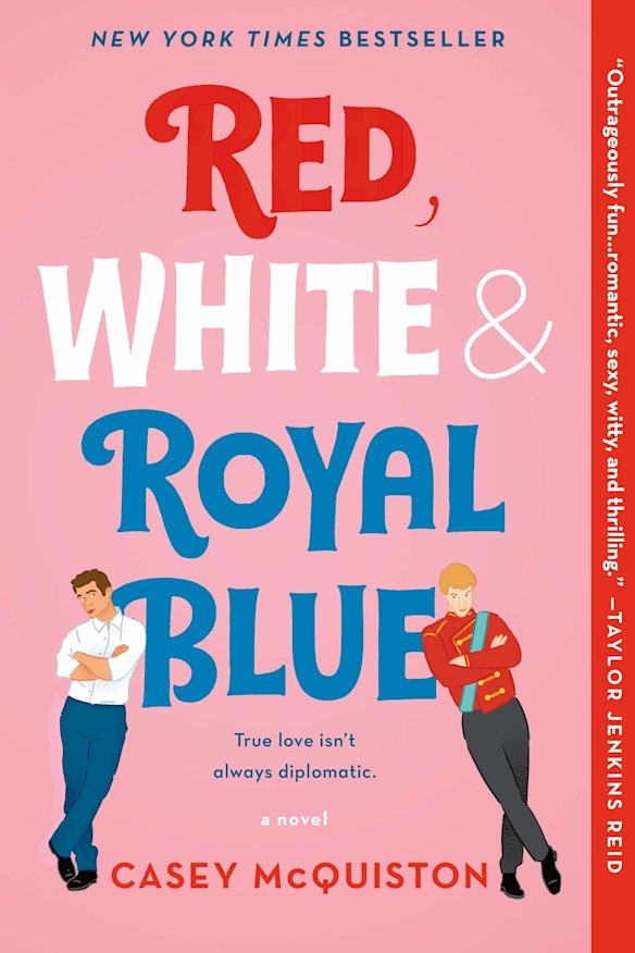
On the other end of the spectrum, says Teo, are the “cartoon couples” of romances du jour. You know the ones: the side-eyeing lovers of Red, White & Royal Blue; the knowing gaze of viral romp Icebreaker – steamy enough to melt the frigid surrounds; the frolicking vacationers of every Emily Henry affair.
Teo credits the illustrations to the stratospheric rise of romance in Gen-Z readers. Unlike the bodice-busters of yesteryear, she says, “romance is trendy [now]. You want to be seen with it, but there’s still a level of shame.” The middle ground? “A weirdly cartoonish book that looks YA.”
These trends, she says, are inseparable from the publishing industry – an industry locked in a permanent existential struggle, where innovation can pale against the need to survive.
“It’s really difficult to want to do something different when your margins are so slim … No one sits there and predicts the trends in publishing. They just follow the trends.”
And so it’s blobs, brushstrokes and big, big letters all the way – at least until the next Sally Rooney.
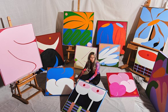
Michael Sun is a freelance writer and graphic designer.
The Booklist is a weekly newsletter for book lovers from Jason Steger. Get it delivered every Friday.